Chicken Farmers of Canada unveils new logo
By Canadian Poultry magazine
News Marketing BoardsOrganization looks to revitalize its corporate look, demonstrate ability to adapt and change.
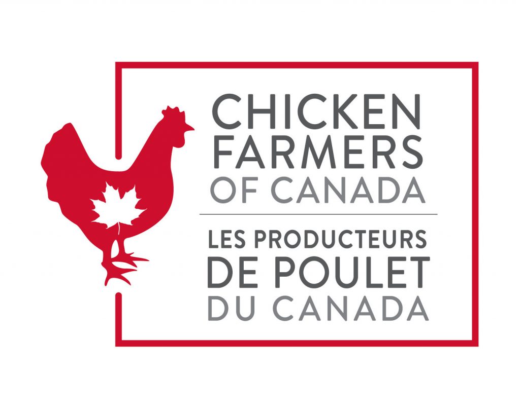 Logo: Chicken Farmers of Canada (CNW Group/Chicken Farmers of Canada)
 Chicken Farmers of Canada is launching a new logo, one that the board says revitalizes its corporate look and demonstrates, visibly, its ability to adapt and change.
The new logo incorporates the distinctive chicken from the Raised by a Canadian Farmer brand logo, as well as other key brand markers. CFC says its main goal for the new logo is to ensure that there is a visible and identifiable connection between the corporate identity and the brand.
“Chicken Farmers of Canada has a history of being able to adapt and change with the times,” says CFC chair Benoît Fontaine. “And change we have over the past 40-plus years. When we started, our logo looked very different. And since then, we’ve been through five iterations of that logo.”
CFC feels the new logo will help support the brand and make it easier to promote.
“Now, with our upcoming move to a new, modern office, we believe it’s time to change that logo to better reflect who we are,” Fontaine says. “In the spirit of evolution, I am pleased to launch the brand-new corporate logo for Chicken Farmers of Canada. It reinforces that our brand is a part of everything we do.”
The Raised by a Canadian Farmer brand for Canadian chicken was launched four years ago. Thirty-six national and regional industry partners are actively using the logo.
And, recent studies show that 87 per cent of Canadians believe that it is important that Canadian chicken be labelled as Canadian and that Canadian chicken is raised by farmers they can trust.
Print this page